
Introduction
In today’s digital era, the importance of having a responsive website cannot be overstated. With the increasing number of users accessing the internet through mobile devices, it is crucial to create a website that seamlessly adapts to different screen sizes and resolutions. This comprehensive guide will walk you through the process of creating a responsive WordPress website, providing valuable insights and expert tips along the way.
Table of Contents
1. Understanding Responsive Design: Ensuring Optimal User Experience
Once you’ve installed WordPress, it’s essential to configure its settings for a responsive website that offers optimal performance and functionality. This involves fine-tuning various aspects such as the permalink structure, caching settings, and search engine visibility. By adjusting these settings, you ensure that your WordPress website runs smoothly, providing an excellent user experience. With a responsive WordPress website, visitors will enjoy seamless navigation and optimized display across various devices. It’s crucial to take the time to customize these settings, as they play a significant role in maximizing the performance and usability of your website. Prioritizing these configurations guarantees that your WordPress website delivers a compelling user experience while effectively engaging your audience.
2. Choosing a Responsive WordPress Theme: Setting the Foundation
Choosing the ideal theme is pivotal when constructing a responsive WordPress website. It is imperative to explore themes that specifically emphasize their responsiveness in features and descriptions. These themes are meticulously crafted to be mobile-friendly, providing adaptable layouts that seamlessly adjust to varying screen sizes. When selecting a theme for your WordPress website, it is vital to consider factors such as design aesthetics, customization options, and reliable support. By prioritizing responsiveness and assessing these aspects, you can ensure the theme aligns with the unique requirements of your website, promoting a seamless and user-friendly experience on different devices.
3. Installing WordPress: Laying the Groundwork

Before delving into the design and customization process, you need to install WordPress to create a responsive website. The installation process involves following these steps:
- Obtain hosting: Choose a hosting provider that offers WordPress support for your website.
- Set up a database: Create a database for your WordPress website, usually done through your hosting provider’s control panel.
- Install WordPress software: Use the one-click installation feature provided by your hosting provider to quickly set up WordPress.
- Customize the design: Select a responsive WordPress theme that suits your website’s style and objectives.
- Configure plugins: Enhance your website’s functionality by installing and configuring plugins for features like contact forms, SEO optimization, and social media integration.
- Create content: Start adding pages, posts, and media to your WordPress
4. Configuring WordPress Settings: Optimizing Performance and Functionality
Configuring the settings of your WordPress website is vital for achieving optimal performance and functionality, especially when aiming to create a responsive WordPress website. After installation, it’s crucial to fine-tune various aspects to ensure a smooth user experience. Key areas to focus on include adjusting the permalink structure, enabling caching for improved loading speed, and configuring search engine visibility to enhance discoverability. These actions are essential for a responsive WordPress website that not only runs smoothly but also delivers an excellent user experience. By taking the time to optimize these settings, you can create a website that is both efficient and user-friendly, enhancing its overall performance and functionality.
5. Customizing the Theme: Tailoring the Look and Feel
A significant benefit of utilizing WordPress is the flexibility it offers in customizing the appearance and functionality of your website through themes and plugins. With a responsive WordPress theme, you have the opportunity to personalize your website’s colors, typography, layouts, and various other aspects using the theme’s customization options. It is crucial to conduct regular testing on your responsive WordPress website as you make modifications to guarantee its optimal appearance and functionality across different devices. This allows you to ensure that your website maintains its visual appeal and usability, regardless of whether it is accessed from a desktop computer, a tablet, or a smartphone.
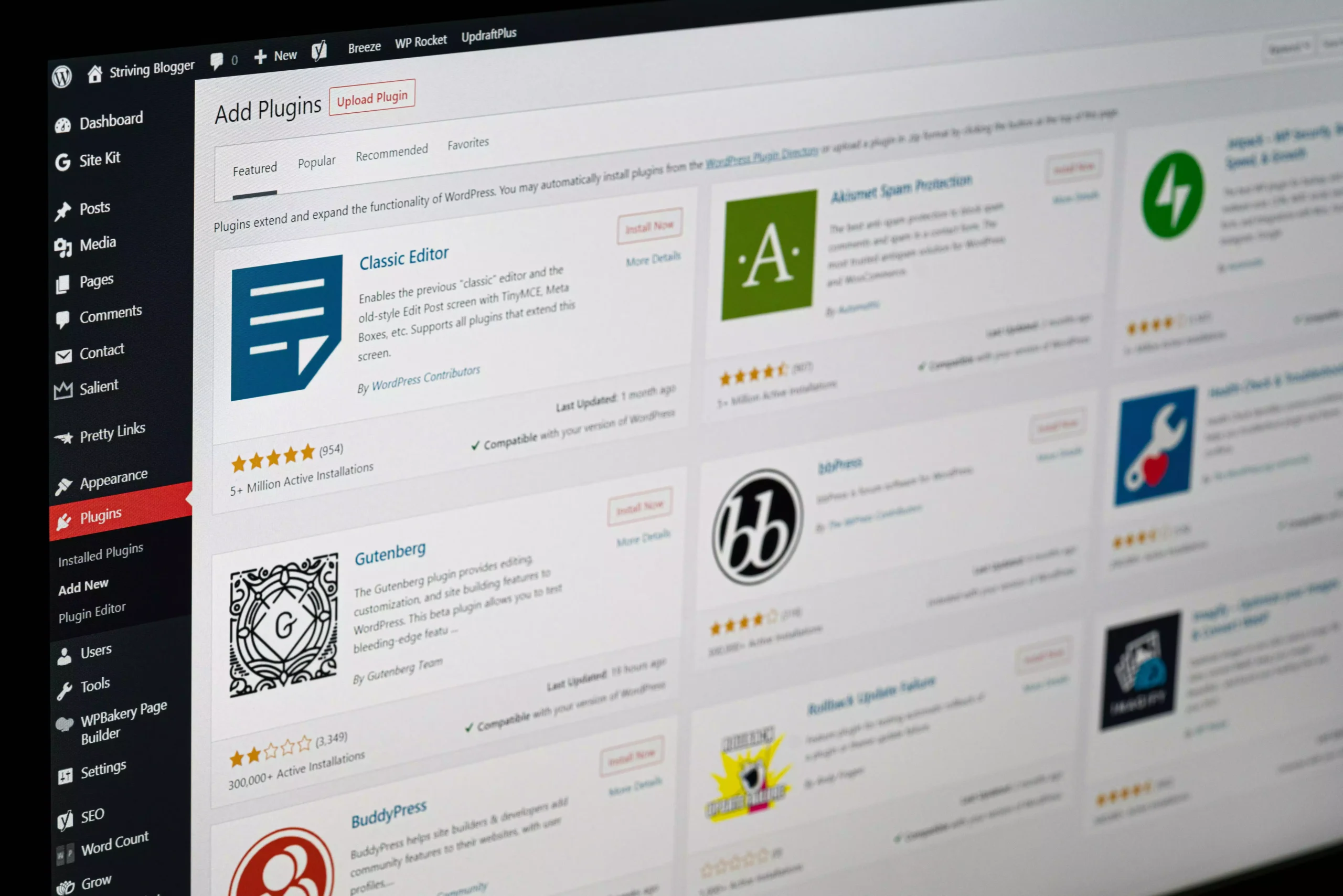
6. Adding and Managing Plugins: Extending Functionality
Plugins play a crucial role in expanding the capabilities of your responsive WordPress website. It is important to select plugins that are compatible with your chosen responsive theme. These plugins can enhance various aspects of your WordPress website, such as contact forms, social media integration, search engine optimization, caching, and more. However, it is vital to exercise caution when installing plugins to avoid potential performance problems. Keep in mind that the number of plugins you incorporate should be limited to maintain optimal website performance. By judiciously leveraging plugins, you can unlock a world of possibilities and maximize the functionality of your responsive WordPress website. Learn More
7. Optimizing Images for Responsiveness: Enhancing Performance
Optimizing images is vital for responsive WordPress websites as it directly influences website performance. To enhance loading speed and responsiveness, employ image optimization techniques specific to WordPress. Focus on compressing images without compromising quality, ensuring they don’t weigh down the site. Additionally, resize images to suit various screen sizes, enabling seamless browsing across devices. Implement lazy loading, which delays the loading of images until they are needed, further reducing initial load times. By incorporating these image optimization practices into your WordPress website, you can strike a balance between high-quality visuals and improved performance, creating a user-friendly experience for visitors.
8. Creating a Mobile-Friendly Navigation: Enhancing User Experience
Effective navigation is essential for a seamless user experience on a responsive WordPress website. It is crucial to design a user-friendly navigation menu that caters to both desktop and mobile devices. When optimizing for mobile devices, consider implementing navigation patterns such as hamburger menus or collapsible menus to enhance navigation ease on smaller screens. By incorporating these responsive design elements, users can effortlessly navigate through the WordPress website, regardless of the device they are using. This ensures a positive user experience, allowing visitors to access content and explore different sections conveniently. Prioritizing mobile optimization and responsive design is vital for maximizing usability and engagement on a WordPress website.
9. Designing Responsive Layouts: Captivating Users Across Devices
When developing content for a responsive WordPress website, it’s crucial to focus on the layout. Implement responsive design principles, including fluid grids, flexible images, and media queries, to guarantee visually appealing content across different screen sizes. Ensure a seamless and consistent user experience by testing your layouts on various devices. With a responsive WordPress website, optimizing the layout becomes essential. Incorporate fluid grids, flexible images, and media queries based on responsive design principles. Thoroughly test your content on different devices to ensure a visually pleasing experience across diverse screen sizes. This meticulous approach will help you provide a seamless and consistent user experience on your WordPress website.
10. Testing Responsiveness: Ensuring a Flawless User Experience
Testing the responsiveness of your WordPress website is vital for detecting issues and finding areas for enhancement. It is recommended to utilize online tools and device emulators to simulate various screen sizes and resolutions. Assess the alignment, image scaling, font readability, and overall usability across different devices. Ensuring that your responsive WordPress website adapts well to varying screen sizes will enhance user experience. By regularly testing and analyzing the outcomes, you can identify any shortcomings and implement necessary modifications. These actions will result in an improved user interface and optimized performance for your WordPress website across multiple devices.
11. Speed Optimization: Accelerating Website Performance
A responsive WordPress website’s loading speed plays a pivotal role in user satisfaction and search engine rankings. Enhance your site’s performance by implementing effective techniques such as caching, minifying CSS and JavaScript files, enabling browser caching, and integrating content delivery networks (CDNs). These optimizations will ensure your WordPress website loads swiftly and seamlessly on all devices, delivering a remarkable user experience. Boosting loading speed not only fosters user engagement but also elevates your WordPress website’s visibility in search engine results, making it an essential aspect of your digital presence. Stay ahead of the competition by prioritizing website speed for better user engagement and enhanced SEO performance.
12. Best SEO Practices: Enhancing Visibility and Rankings

To ensure your responsive WordPress website stands out in search engine rankings, it is essential to follow the best SEO practices. Incorporate the following key practices to optimize your website:
- Quality Content: Develop unique, informative, and engaging content that adds value to your target audience. Naturally, integrate relevant keywords to enhance visibility in search results.
- Keyword Research: Conduct comprehensive keyword research to identify relevant terms and phrases searched by your target audience. Utilize tools like Google Keyword Planner or SEMrush to discover high-volume, low-competition keywords.
- On-Page Optimization: Optimize web pages by incorporating target keywords in titles, meta descriptions, headings, and URLs. Ensure well-structured, reader-friendly content enriched with relevant multimedia elements.
- Mobile-Friendly Design: With the surge in mobile device usage, ensure a mobile-friendly website design for a seamless user experience.
- Page Speed: Optimize website loading speed by optimizing images, minimizing CSS and JavaScript files, and enabling browser caching.
- URL Structure: Create descriptive, concise, and keyword-inclusive URLs for search engine friendliness.
- Internal Linking: Enhance website navigation and user engagement by incorporating relevant internal links.
- External Linking: Link to reputable and authoritative websites to enhance credibility and trustworthiness.
- Social Media Integration: Promote content on social media platforms for increased visibility, reach, and engagement.
- User Experience: Prioritize user-friendly website design, intuitive navigation, and responsive layouts.
- Technical SEO: Optimize HTML markup, meta tags, XML sitemaps, and structured data markup for effective content indexing.
13. Ensuring Cross-Browser Compatibility: Consistency Across Browsers
When developing a responsive WordPress website, it’s crucial to acknowledge that various web browsers can interpret your code differently, resulting in design and functionality inconsistencies. To ensure a consistent experience for all users, regardless of their browser preference, thorough testing on popular browsers such as Chrome, Firefox, Safari, and Edge is essential. By testing your WordPress website on these platforms, you can identify any compatibility issues and address them accordingly. This approach will guarantee that your responsive WordPress website delivers a seamless experience to visitors, regardless of the browser they choose to use.
14. Mobile Optimization: Tailoring the Experience for Mobile Users
In today’s mobile-focused world, optimizing your website for mobile devices is vital. Mobile responsiveness greatly influences user experience and overall success. Test your website thoroughly on various smartphones and tablets to ensure compatibility. Pay attention to touch-friendly elements during testing, ensuring accurate response to gestures. Legible text sizes are crucial for small screens, so scale them appropriately. Fluid layouts that adapt to different screen sizes enhance user experience. Consider incorporating mobile-specific features like click-to-call buttons or interactive maps to improve mobile usability. These strategies help create a mobile-responsive website that meets the needs of your mobile audience, leading to increased engagement and satisfaction.
Conclusion
Creating a responsive WordPress website requires careful consideration of design, functionality, and optimization. By following the steps outlined in this comprehensive guide, you can build a website that seamlessly adapts to different devices, engages your audience, and improves your online presence. Embrace responsive design principles, leverage WordPress customization options, and regularly test and optimize your website for the best results.
FAQs: Frequently Asked Questions

Is responsive design necessary for all websites?
Yes, responsive design is crucial for all websites as it ensures a positive user experience across devices and improves search engine rankings.
Can I make an existing WordPress website responsive?
Yes, you can make an existing WordPress website responsive by switching to a responsive theme, using plugins for responsive functionality, and optimizing your content for different screen sizes.
Are there any free responsive WordPress themes available?
Yes, there are many free responsive WordPress themes available in the WordPress theme repository. You can also find premium responsive themes for more advanced features and customization options.
How do I test my website’s responsiveness?
You can test your website’s responsiveness using online tools like Google’s Mobile-Friendly Test or by manually checking your website on different devices and screen sizes.
What is the importance of website speed in responsive design?
Website speed is crucial in responsive design as it impacts user experience and search engine rankings. Optimizing your website’s speed ensures fast-loading pages on all devices, leading to better engagement and conversions.


